147 Invitation
Branding, Art Direction
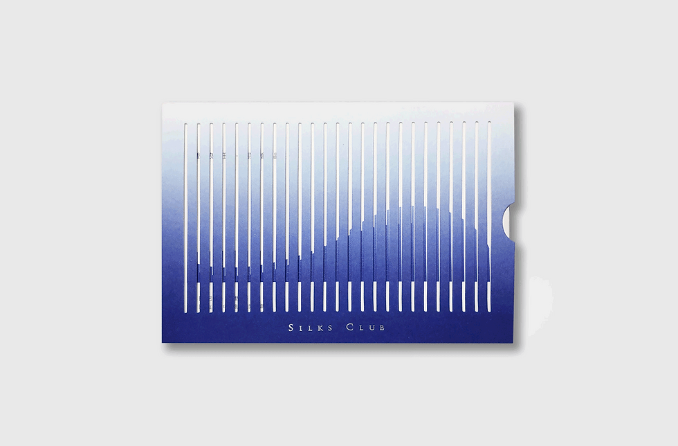
The idea behind the invitation was to demonstrate the vitality of the ocean that matched the founder’s business philosophy. The animation of waving was inspired by OP Art. The die-cut envelope and bar-figured paper showed a persistent vision. The audience will experience the movement of the sea while pulling out the paper.

Silks Club is located in Kaohsiung, the city which is a hub of communication, and economic prosperity because of the ocean. Therefore, the founder believes water can bring fortune and luck. The series concepts of the invitation were all inspired by the founder's philosophy about ocean and water.
Concept 01

Concept 02

Concept 03

Concept 04

Concept 05

Concept 06

Development of Waves


Challenge
The main challenge was how to avoid the color of blue gradient fading on the folding edges. After several prototyping samples, the vendor and I found a way - have the folding edge stay in the original color of paper, the gradient started from the bottom and faded out near the top.
Outcome
The invitation receivers were all amazed at the “waving animation” while pulling out the card from the envelope. The founder of the hotel was really satisfied with the effectiveness of traditional material with the fresh display.


